[Content required]One sentence introducing APW and what the new identity and website needed to do.
Client
ADHD Prescriber Workforce (APW)
Industry
Healthcare
Services
Logo design, Website design
Year
[Content required]Add the project year.
The challenge
[Content required]What needed to be solved? Describe where APW was, who it serves and why the existing visuals weren’t working. Two or three sentences.
Creative direction
[Content required]What concept guided the work? Name the idea, the feeling it needed to create for clinicians, and how it shaped the choices that followed.
Logo & identity
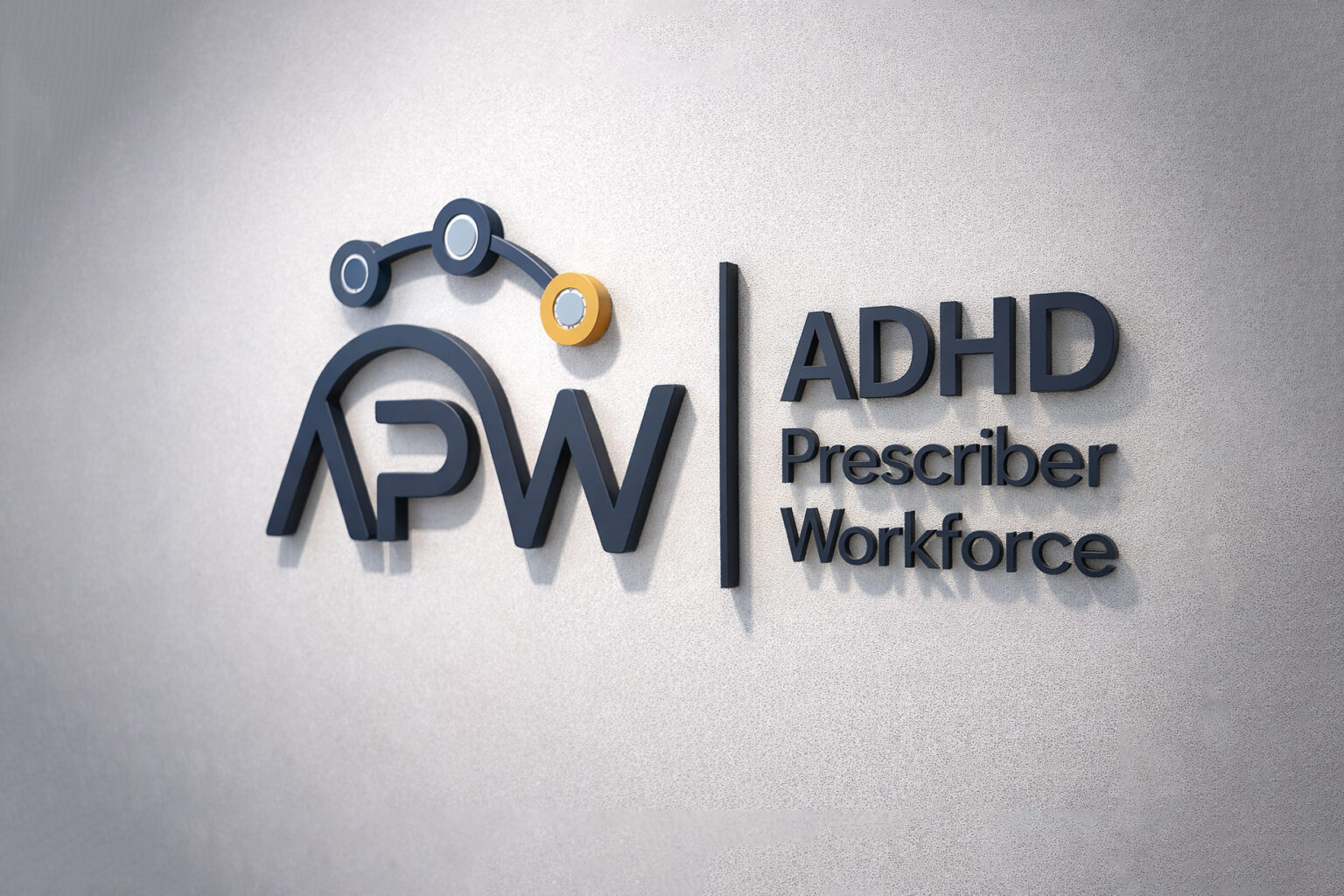
The mark pairs the APW monogram with a small connected-node motif and a clear “ADHD Prescriber Workforce” lock-up, so the full name stays readable wherever the logo appears.
[Content required]Adjust this description if it doesn’t match your intent, and add any logo variations.
Colour & typography
[Content required]Add the APW palette (colour names and hex codes) and the typefaces used, with one sentence on why they were chosen.
Applications
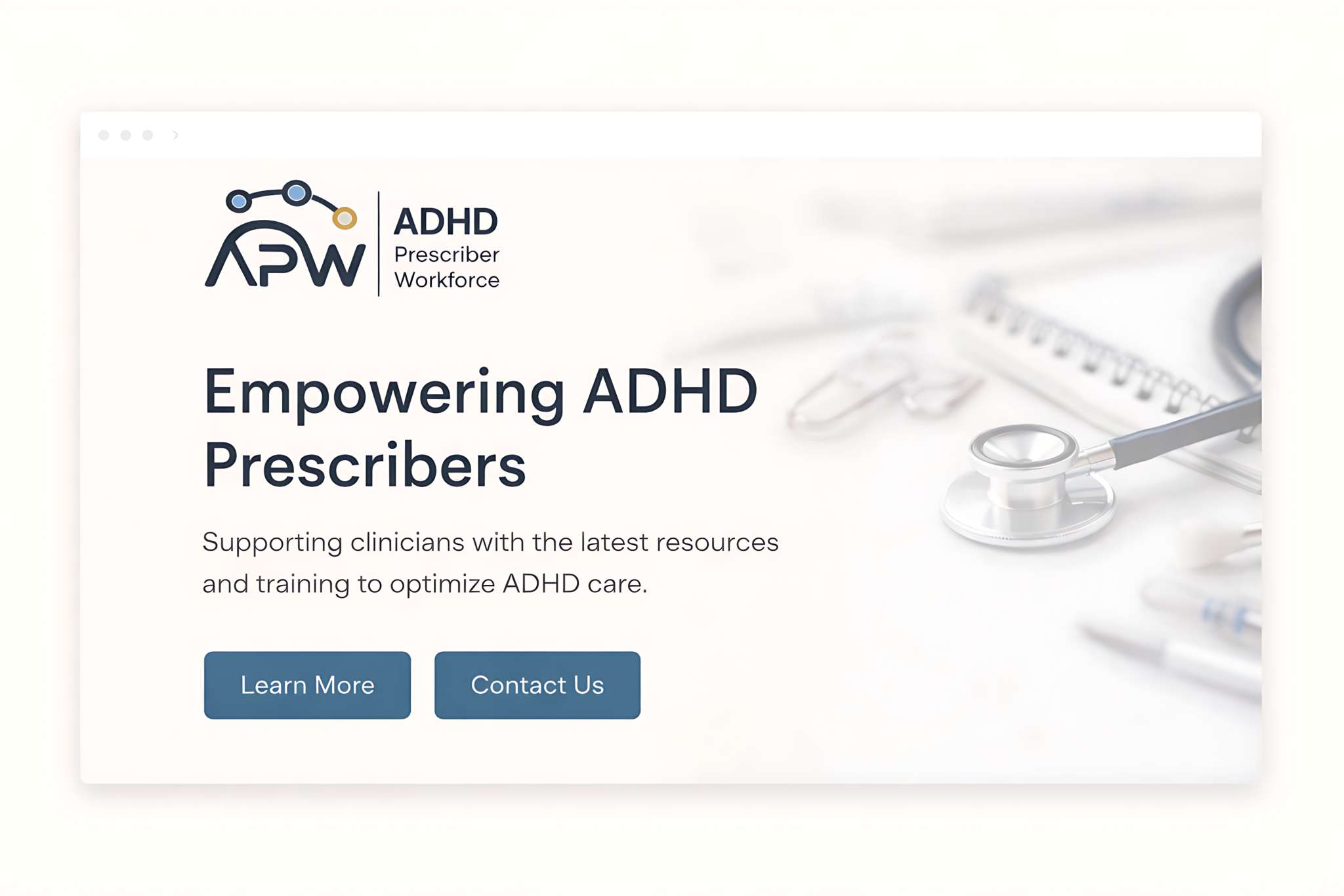
The identity carries through to the website: a calm layout, a clear headline and two direct calls to action.
Outcome
[Content required]A brief conclusion: what was delivered and how APW uses it now. Only include results or feedback the client has confirmed.