SajalGraphics

Work  /  Kitovu

Case study · Fintech

Kitovu

Logo and brand guidelines for Kitovu, a fintech and neobank built to be a trusted, friendly hub for financial services.

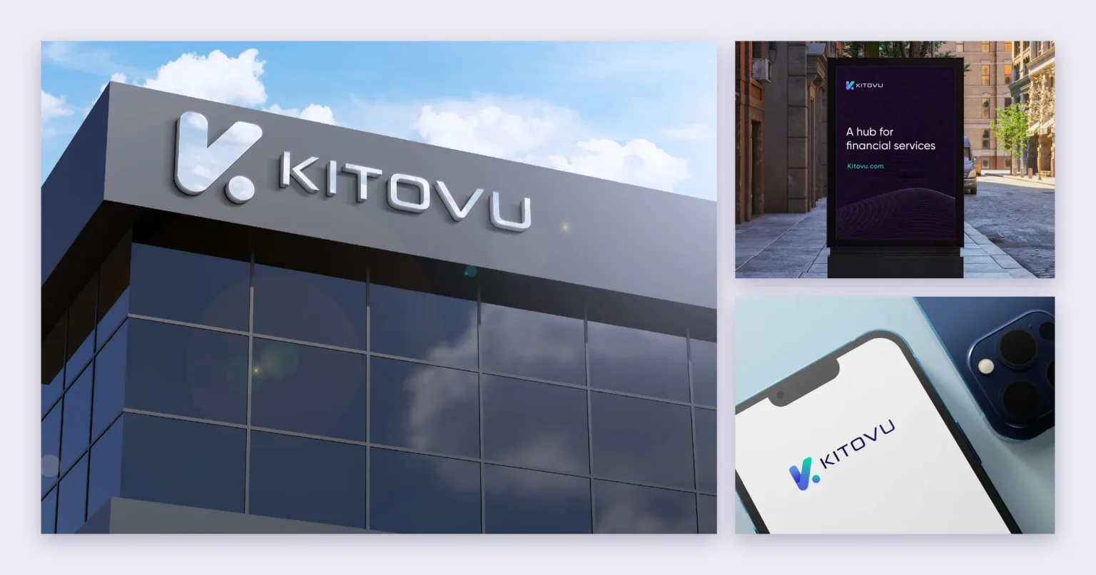
Kitovu logo signage on an office building beside a street poster and a smartphone showing the logo

Client

Kitovu

Industry

Fintech / Neobank

Branding

Logo & brand guidelines

Applications

Signage, apparel & digital

The brand

Kitovu is a fintech and neobank: a hub for financial services that wants to be the fintech people stay with — and grow with.

The brand needed to feel trustworthy, confident and solid, while still being innovative, friendly and caring, with a forward-looking, futuristic edge.

Logo & identity

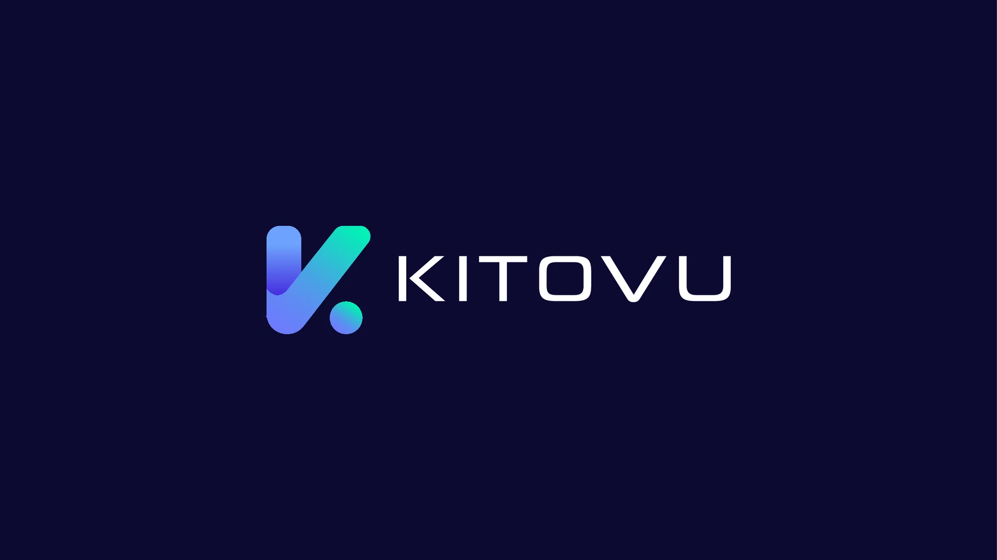
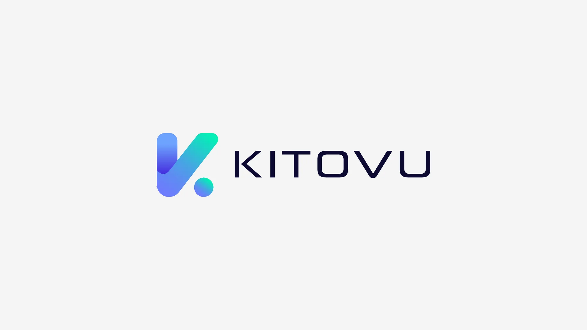
A rounded K monogram, finished with a dot and a violet-to-mint gradient, sits beside a clean, wide-set KITOVU wordmark. Its two strokes also read as a tick.

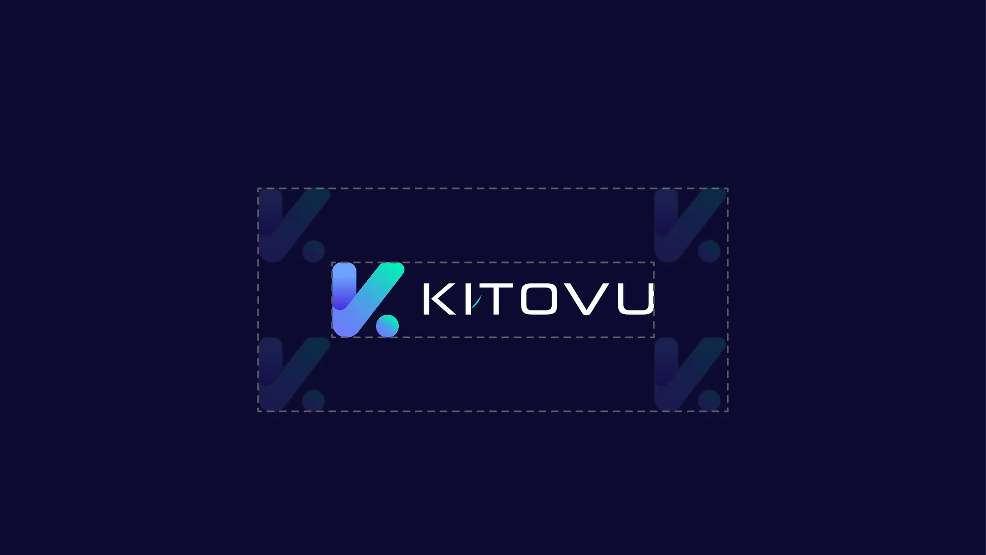
The guidelines show the logo on deep navy and on light grey, as an app icon, and with the clear space it needs around it.
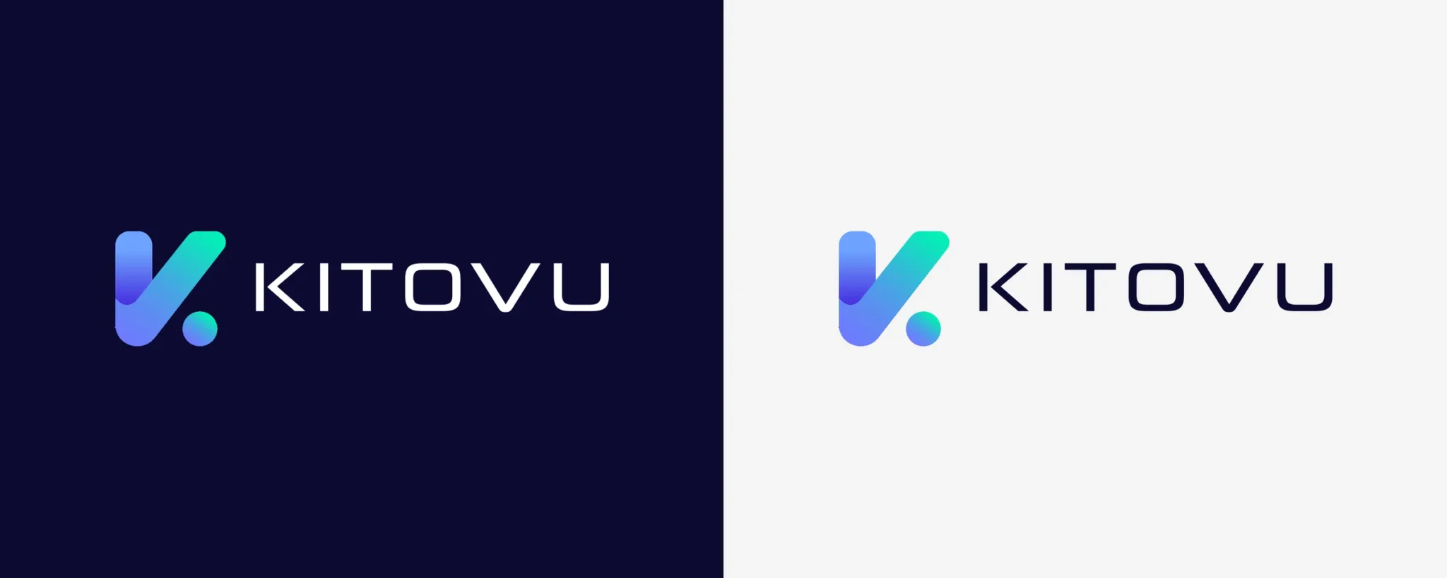
Kitovu logo: a gradient K monogram with the KITOVU wordmark, shown on deep navy and on light grey

Colour & typography

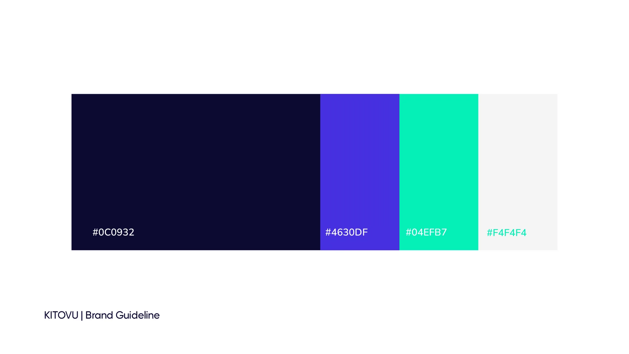
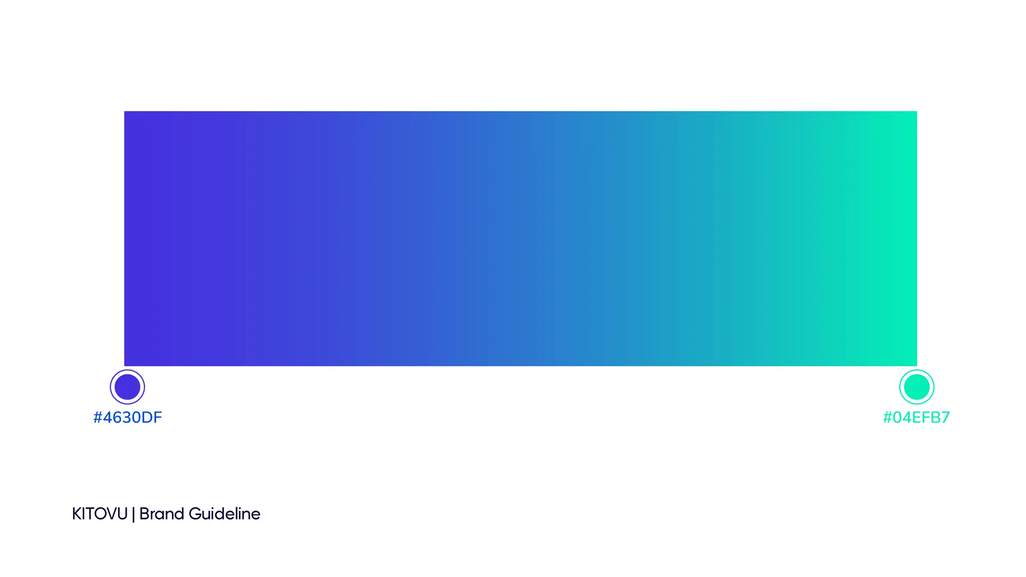
Deep navy sets a calm, solid base. Electric violet and mint add energy and a futuristic glow, and meet in the signature gradient. Light grey keeps layouts clean and open.

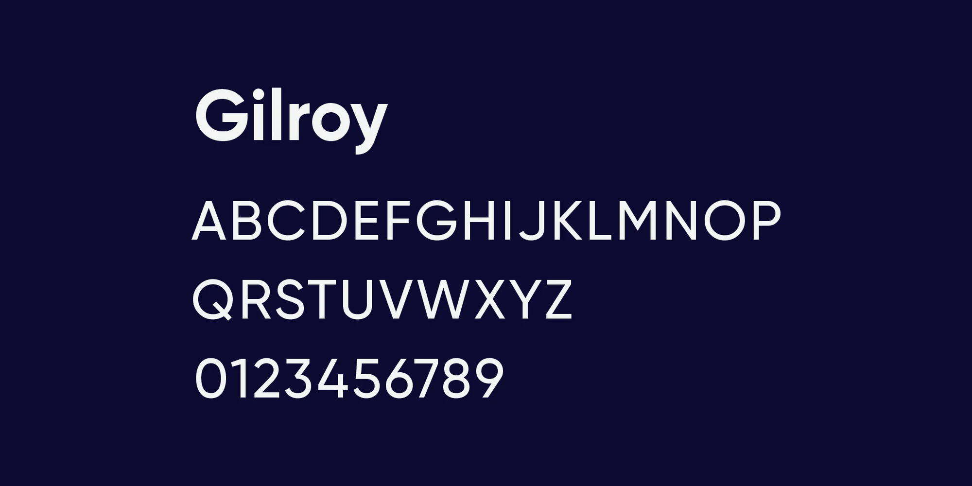
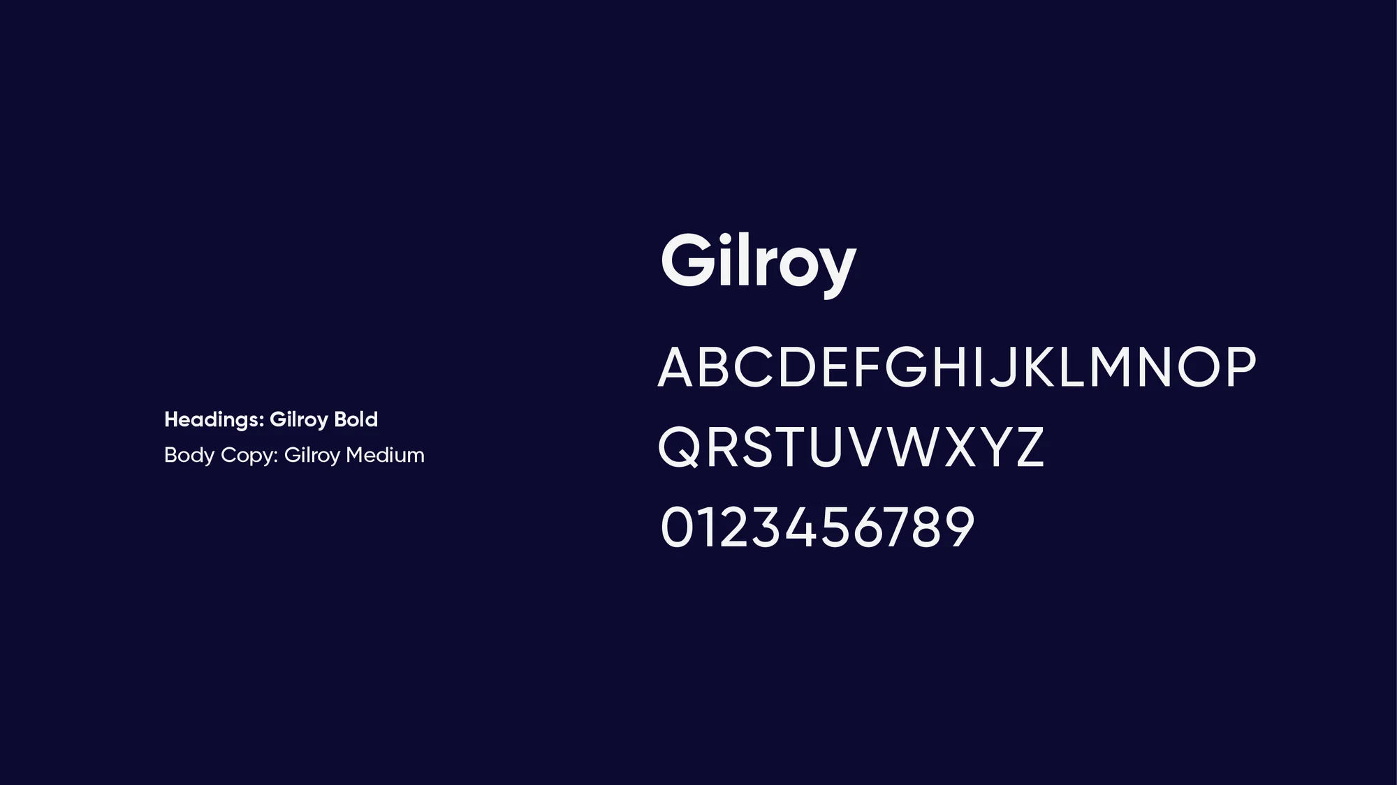
Gilroy carries the brand: Gilroy Bold for headings and Gilroy Medium for body copy.

Deep Navy

#0C0932

Electric Violet

#4630DF

Mint

#04EFB7

Light Grey

#F4F4F4

Signature Gradient

#4630DF → #04EFB7

Gilroy type specimen: Gilroy Bold for headings and Gilroy Medium for body copy

Gilroy Bold — headings · Gilroy Medium — body copy

Brand guidelines

Selected pages from the guidelines: the logo on dark and light backgrounds, app icons, clear space, the colour palette and gradient, and typography.

In use

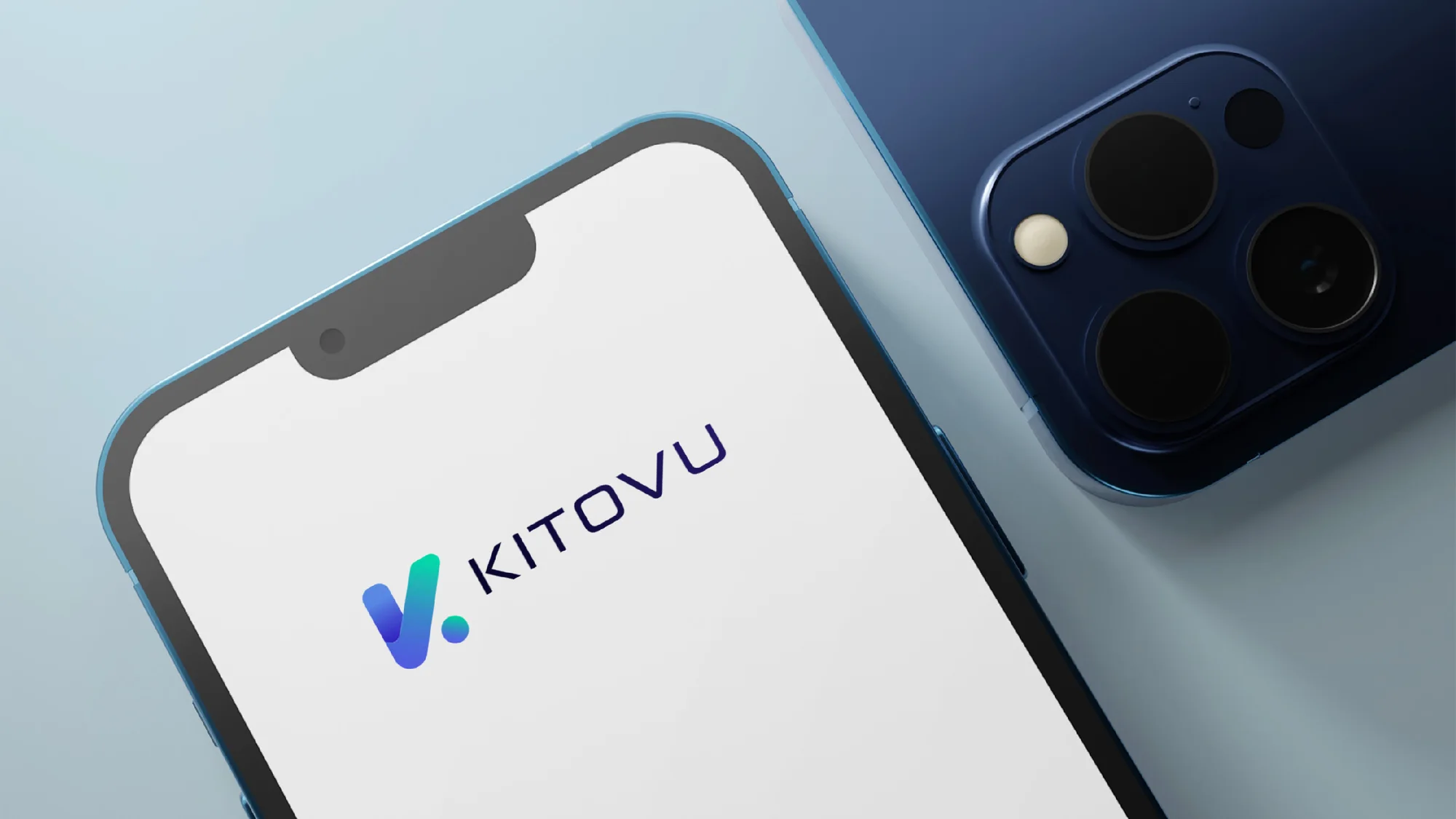
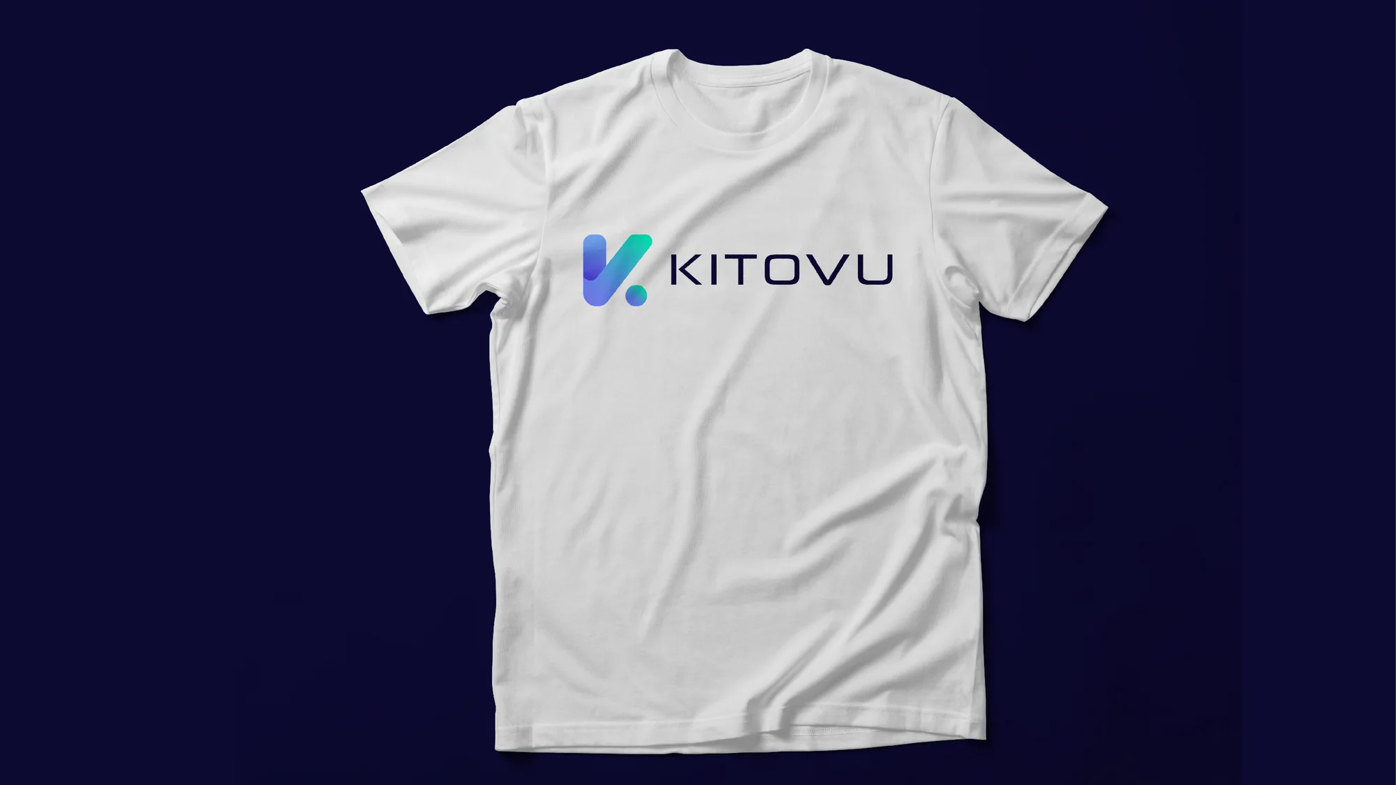
The identity on building signage, a street poster and billboard, a smartphone screen and a branded T-shirt.