SajalGraphics

Work  /  Breath Method

Case study · Breathwork & Wellness

Breath Method

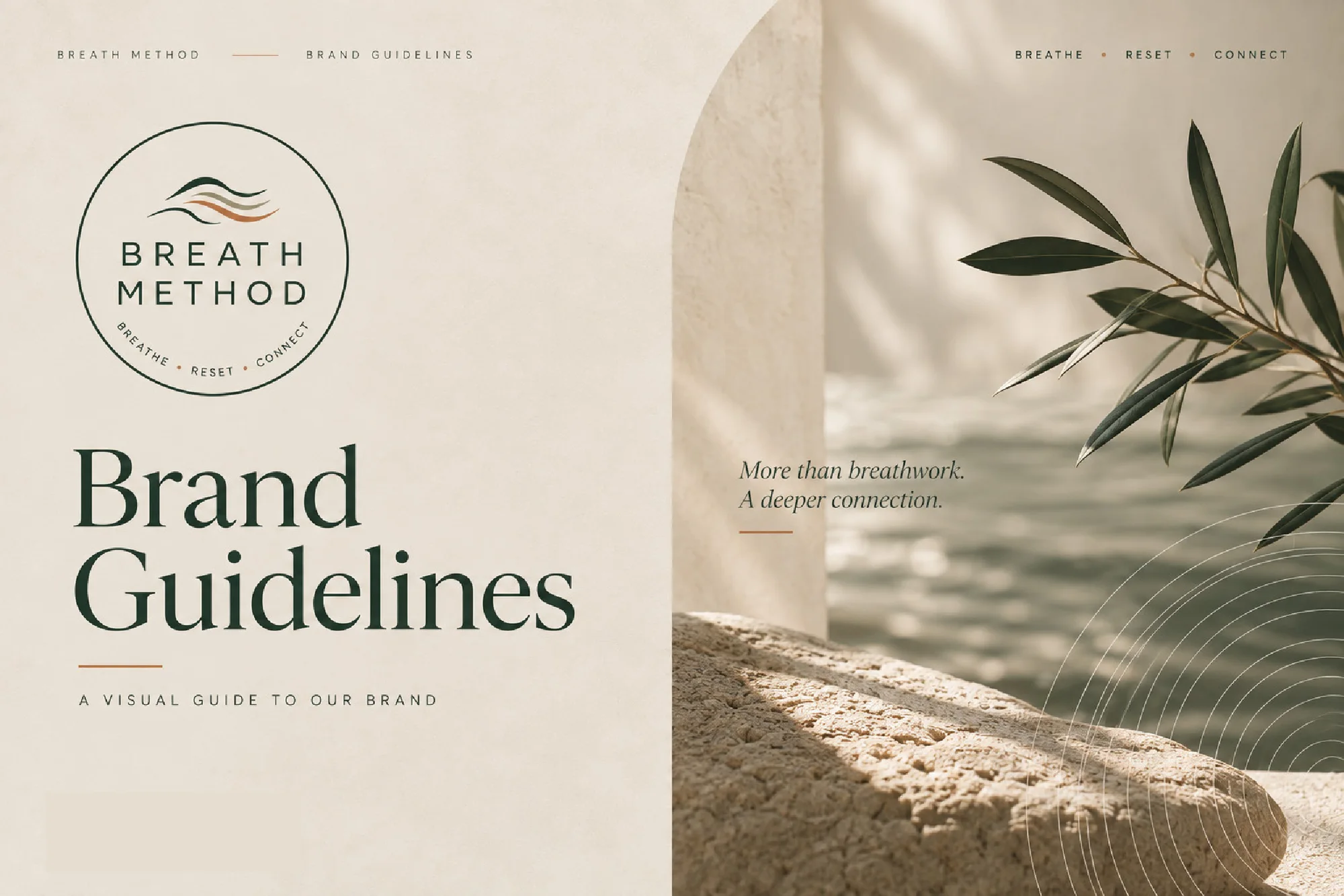
Logo, brand identity and brand guidelines for a breathwork practice about creating space to reconnect: with the breath, the body and ultimately yourself.

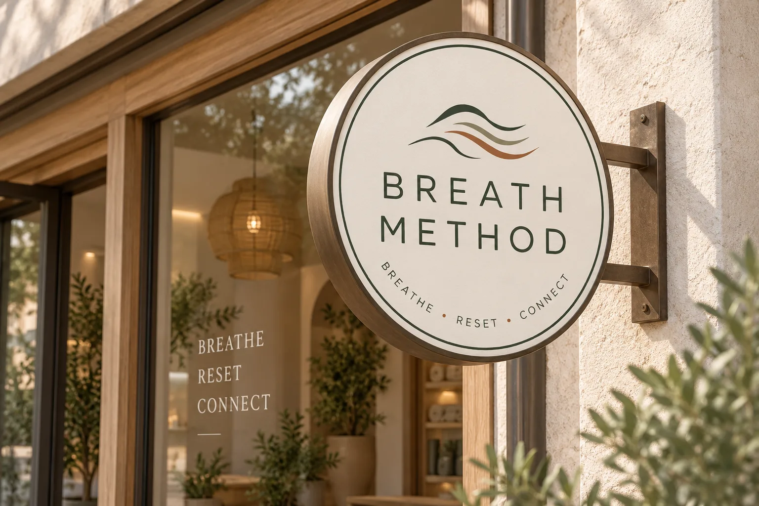
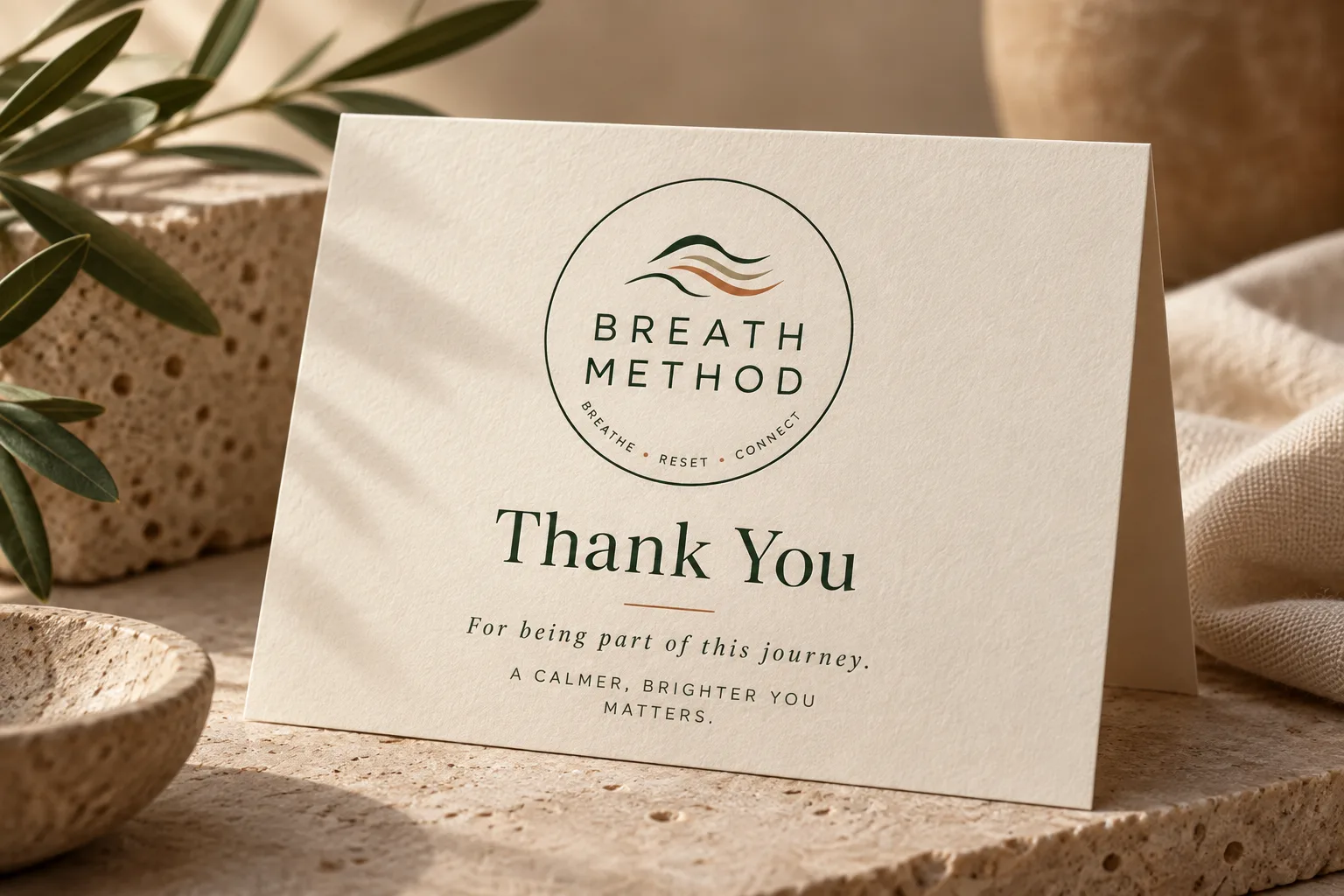
Breath Method signage mockup beside a thank-you card and the circular logo

Client

Breath Method

Industry

Breathwork & Wellness

Branding

Logo & brand guidelines

Applications

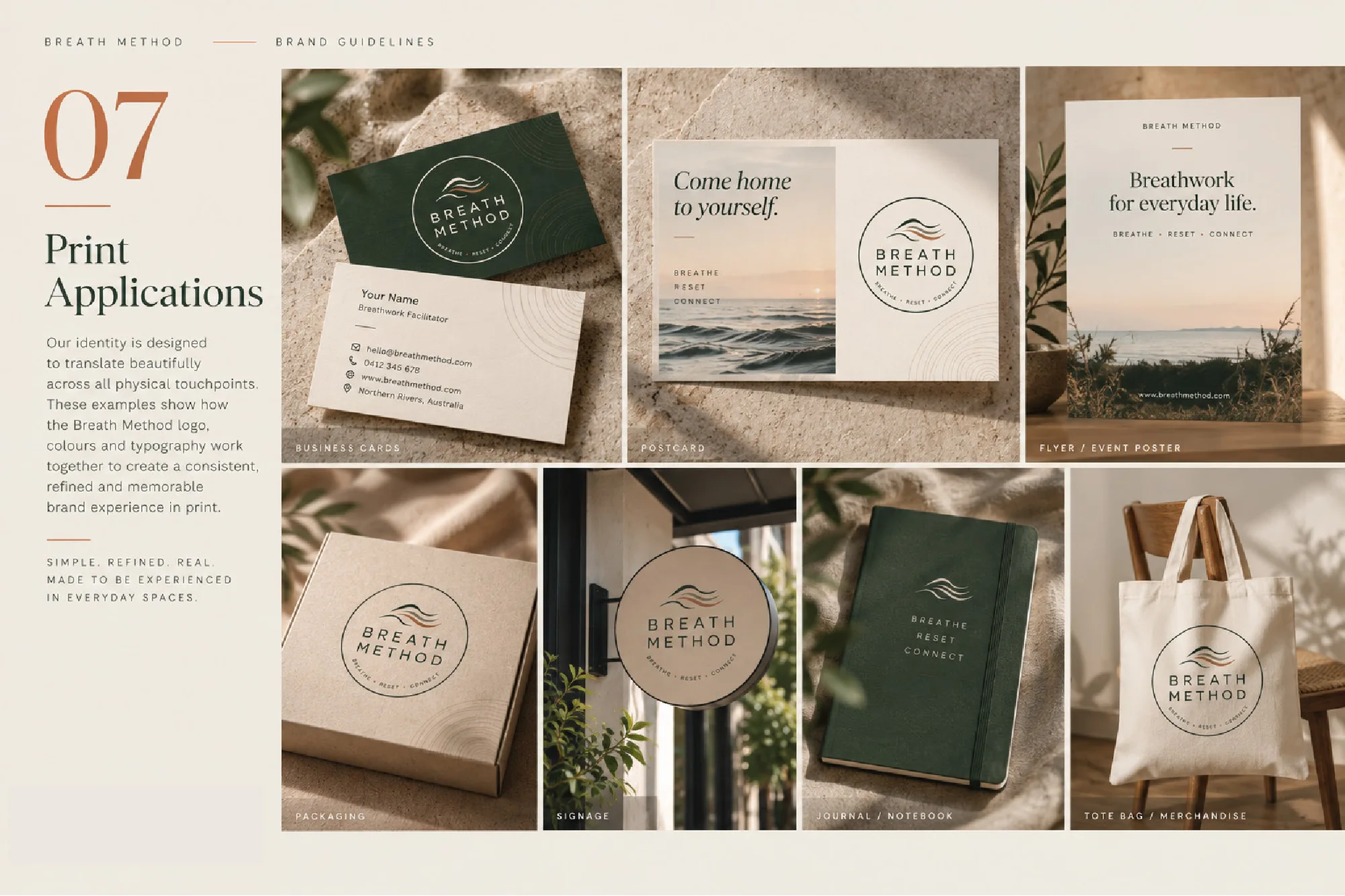
Print, signage & Instagram

The brand

At its heart, Breath Method is about creating space to reconnect: with the breath, the body and ultimately yourself. The brand needed to carry that feeling of returning inward and coming home to yourself.

“Breath” is the foundation of the practice, while “Method” gives it structure and purpose. The name deliberately avoids feeling overly spiritual or complicated; the practice is about using the breath to slow down, reconnect with the body and come home to yourself.

Logo & identity

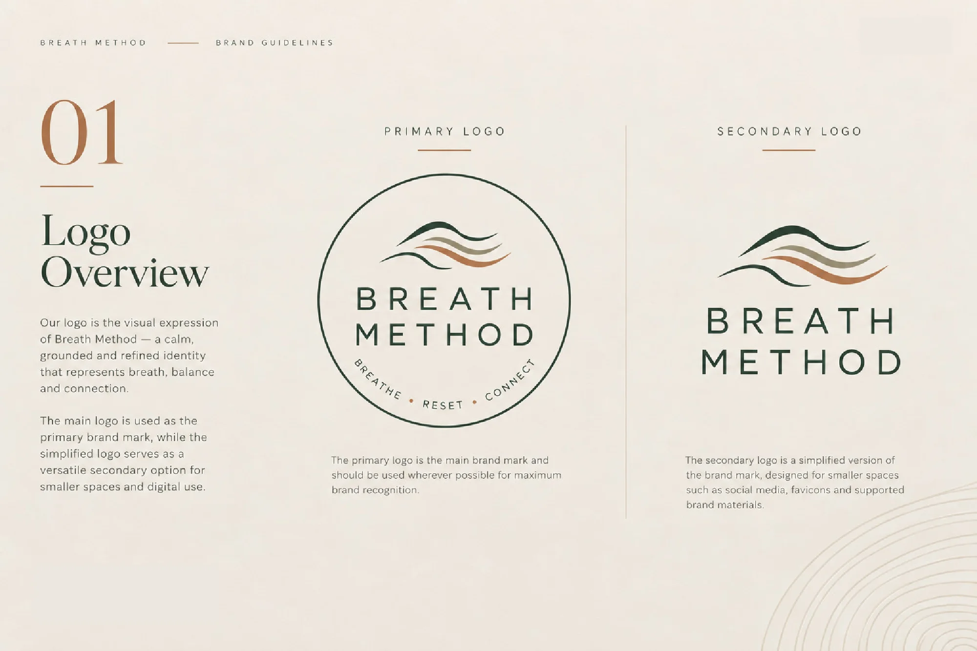
The logo is a calm, grounded and refined expression of breath, balance and connection. A mark of layered, flowing lines sits above the wordmark inside a fine circle carrying the words Breathe · Reset · Connect.

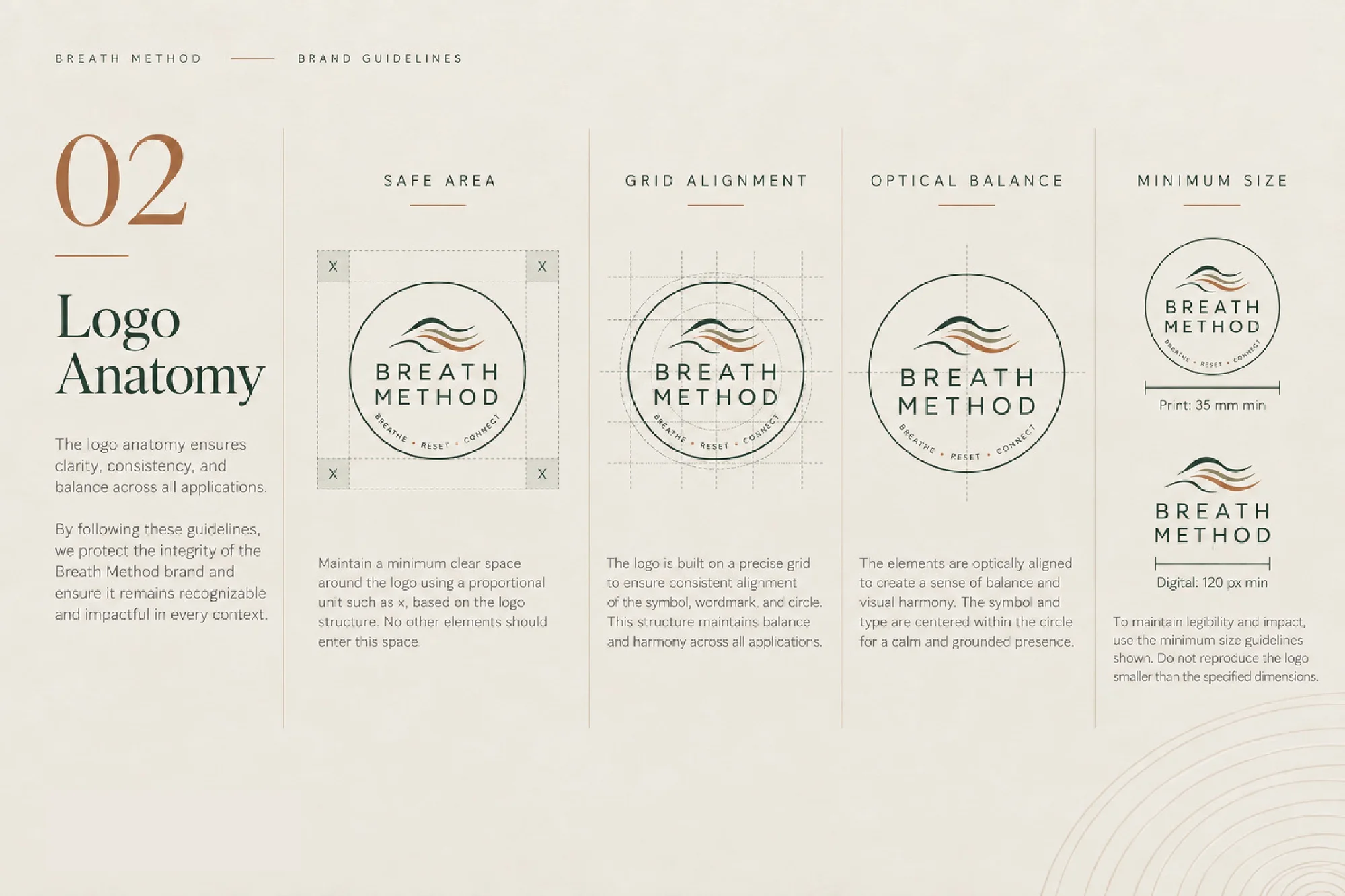
A simplified secondary logo covers smaller spaces and digital use, and the guidelines set clear space, grid alignment, optical balance and minimum sizes so the mark stays consistent everywhere.
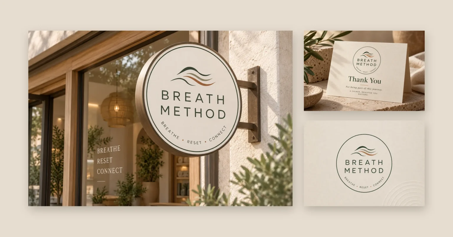
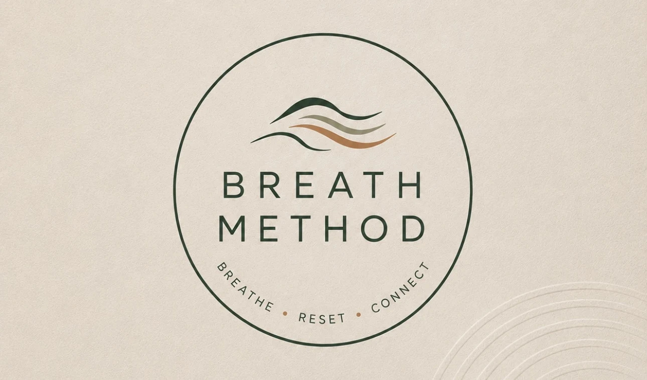
Breath Method primary logo: layered flowing lines above the wordmark inside a circle reading Breathe, Reset, Connect

Colour & typography

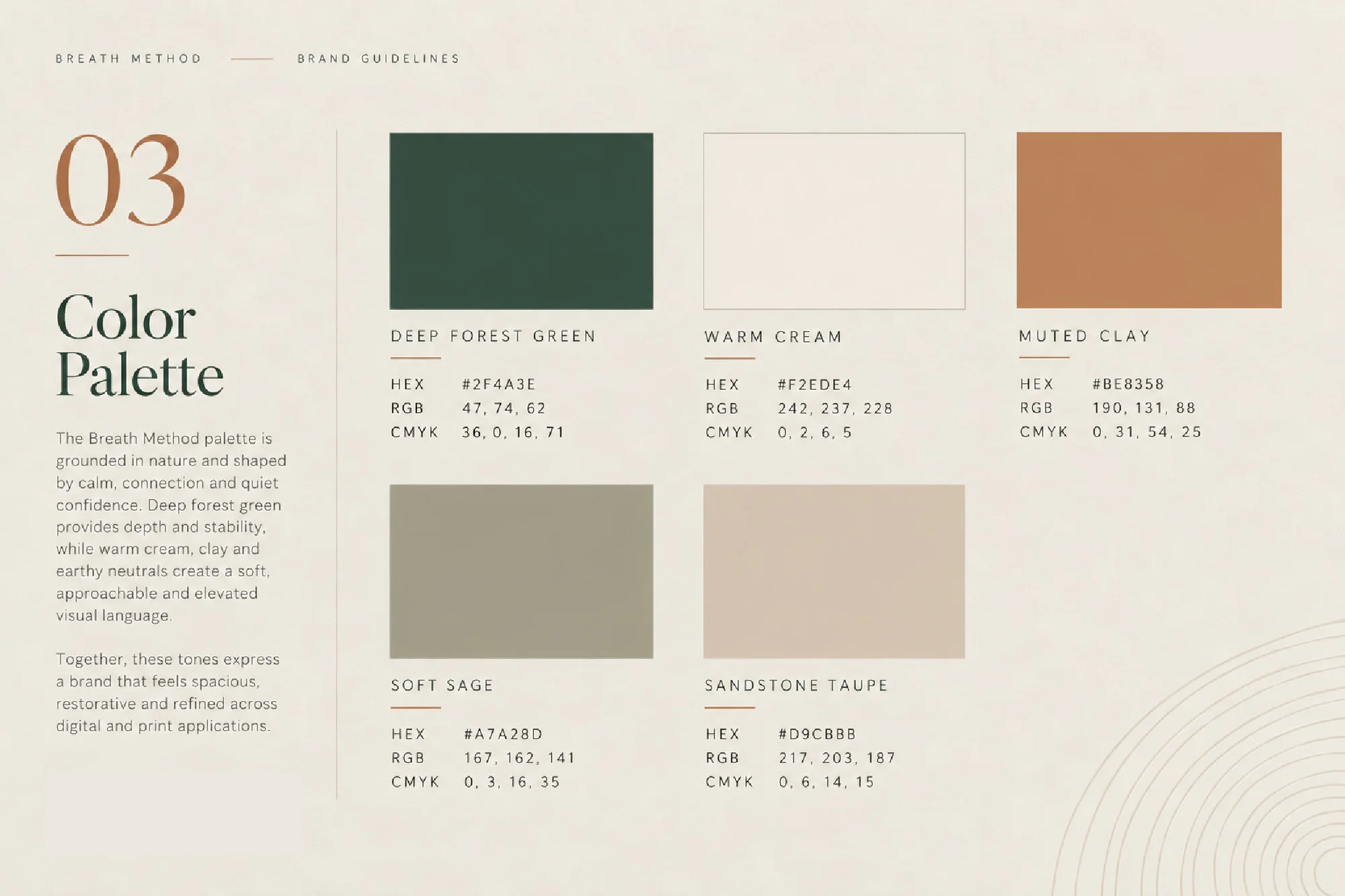
A palette grounded in nature and shaped by calm, connection and quiet confidence. Deep forest green provides depth and stability, while warm cream, clay and earthy neutrals keep the brand soft, approachable and elevated.

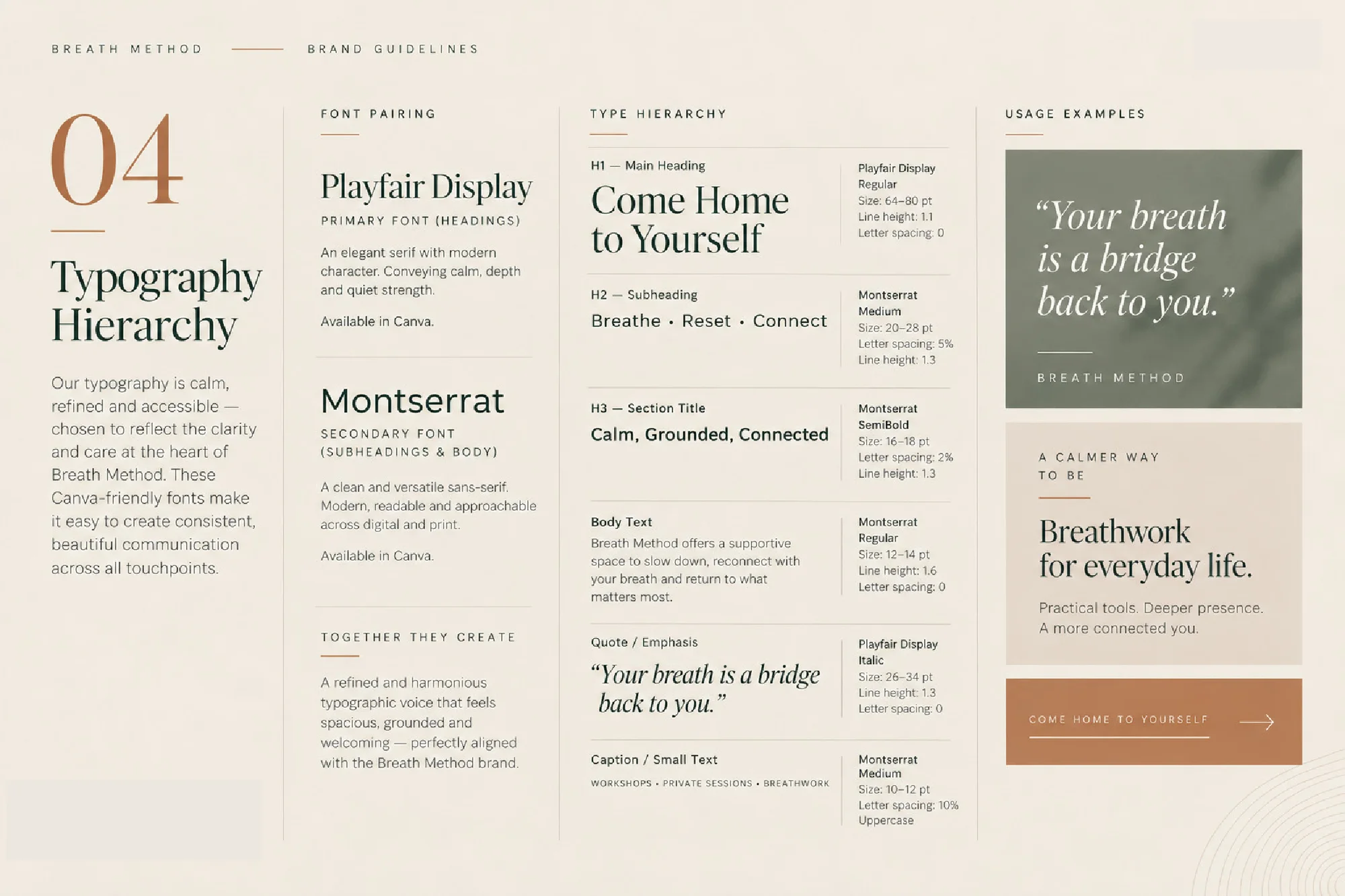
Playfair Display sets the headings and Montserrat handles subheadings and body text. Both are available in Canva, so the client can create consistent designs on their own.

Deep Forest Green

#2F4A3E

Warm Cream

#F2EDE4

Muted Clay

#BE8358

Soft Sage

#A7A28D

Sandstone Taupe

#D9CBBB

Aa

Playfair Display

Serif for headings

Aa

Montserrat

Sans-serif for subheadings and body text

Brand guidelines

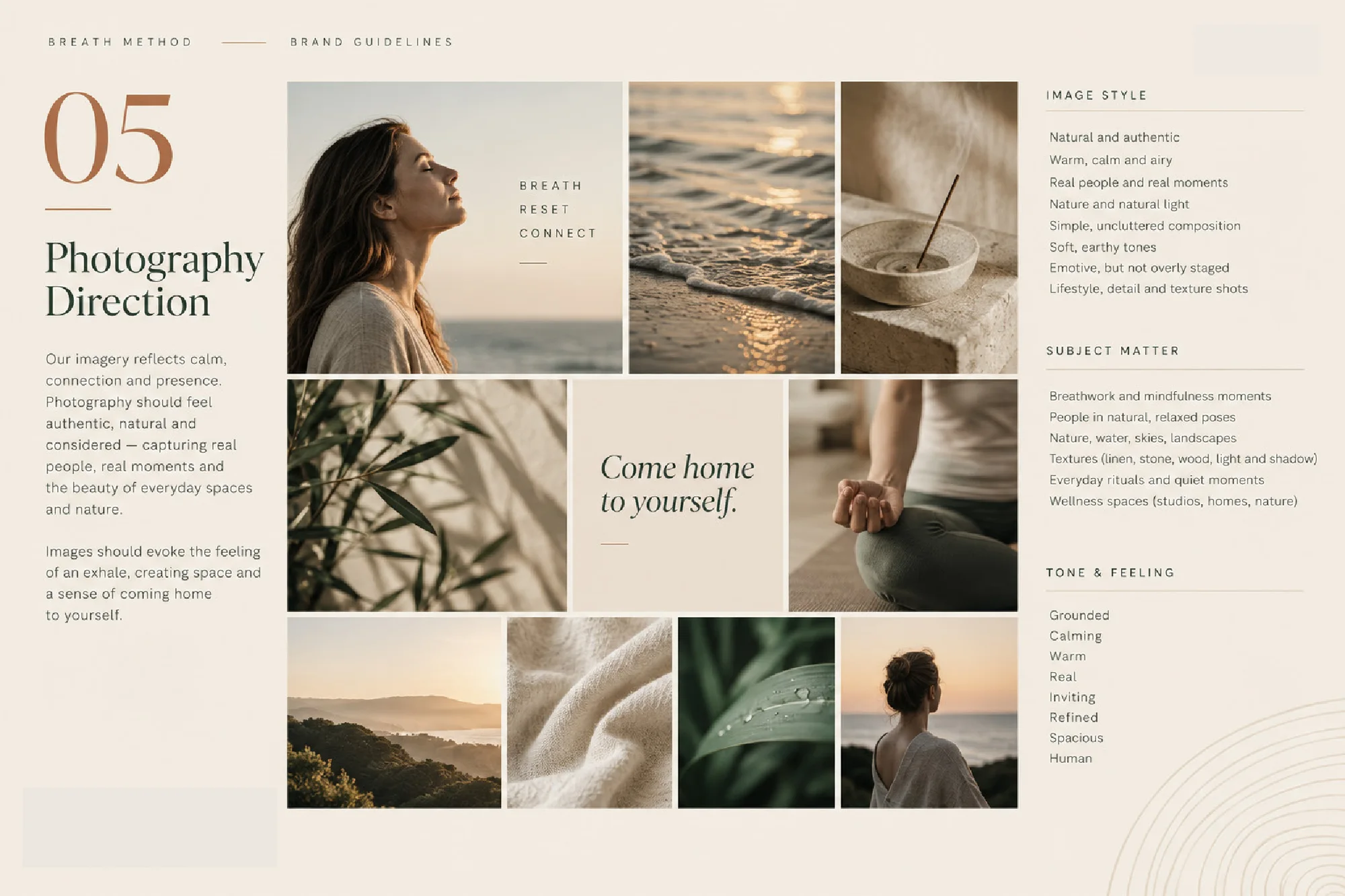
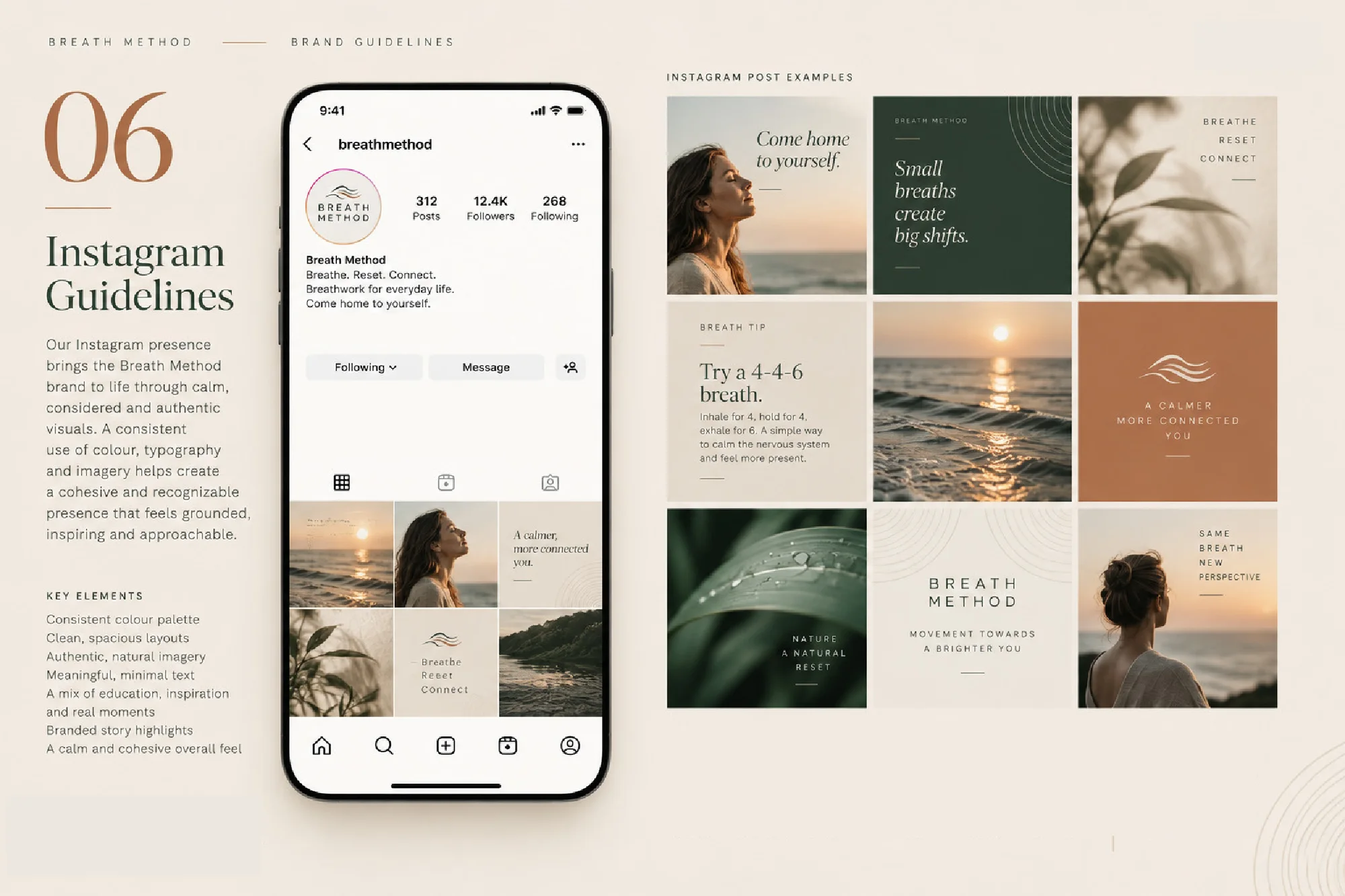
Eight pages covering the logo and its anatomy, colour, typography, photography direction, Instagram guidelines and print applications, from business cards and packaging to signage, journals and tote bags.

Select any page to view it full size.

In use

The identity on exterior signage, and on a thank-you card that carries the brand’s warmth into the client experience.