SajalGraphics

Work  /  Care for All Recovery Center

Case study · Mental Health & Recovery

Care for All Recovery Center

Logo and brand identity for Care for All Recovery Center, an outpatient mental health and substance use recovery center in Texas.

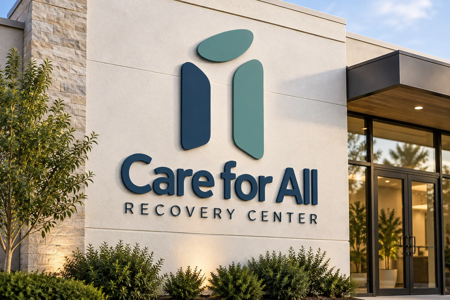
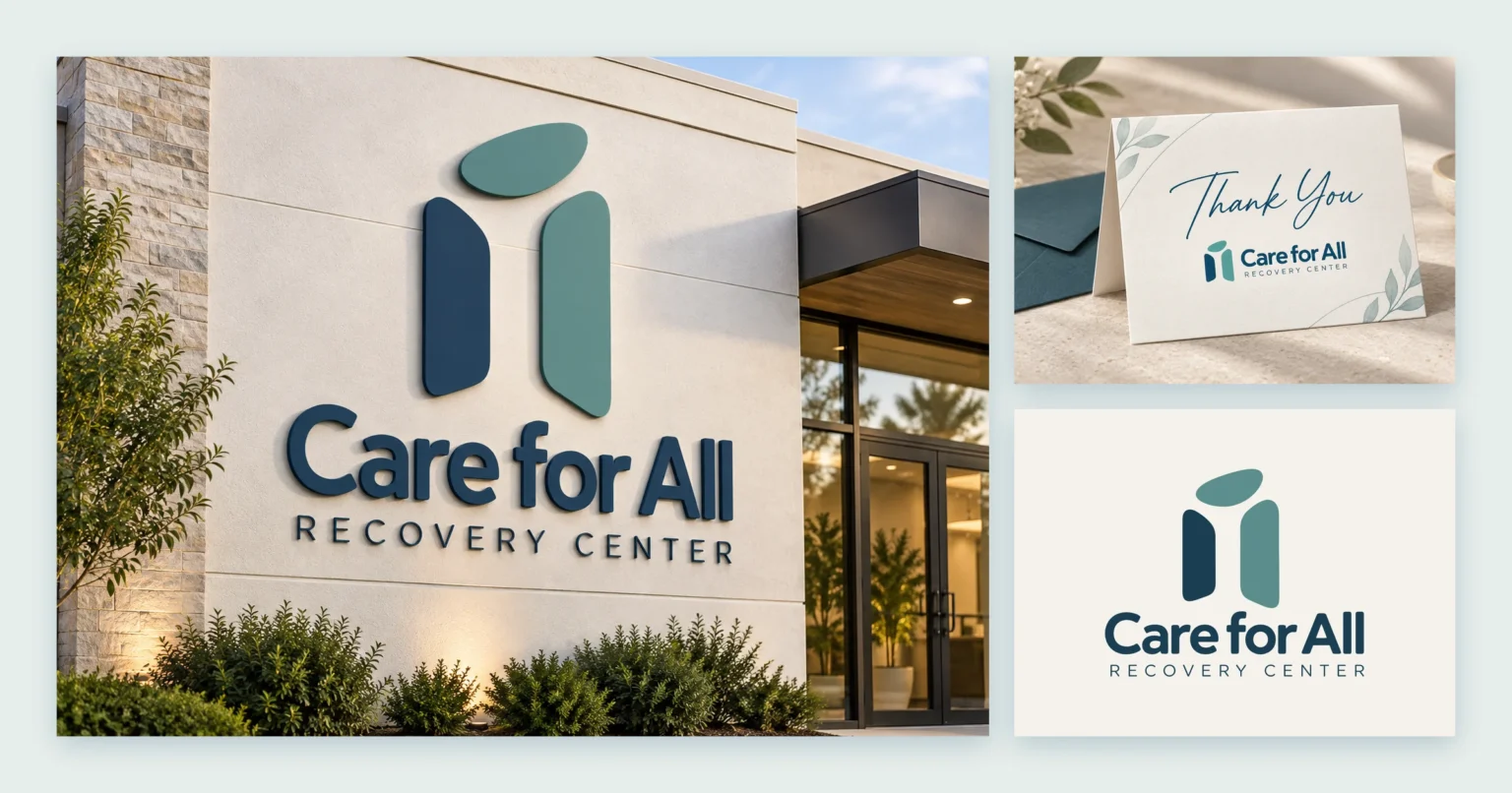
Care for All Recovery Center building signage beside a thank-you card and the stacked logo

Client

Care for All Recovery Center

Industry

Mental Health & Recovery

Branding

Logo & brand guidelines

Applications

Signage & stationery

The brand

Care for All Recovery Center supports people through some of the most difficult moments of their lives, with care that’s respectful, individual and professional.

The brand needed to help everyone who walks through the door feel welcomed, seen, valued and supported — and given a genuine chance to heal and move forward.

Logo & identity

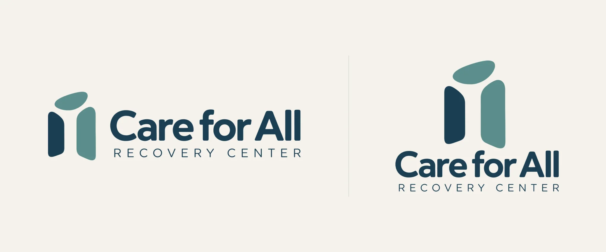
Two soft, rounded forms in deep navy and teal rise beneath a gentle oval: a calm, human mark that the guidelines describe as a visual expression of hope, healing and a more inclusive tomorrow.

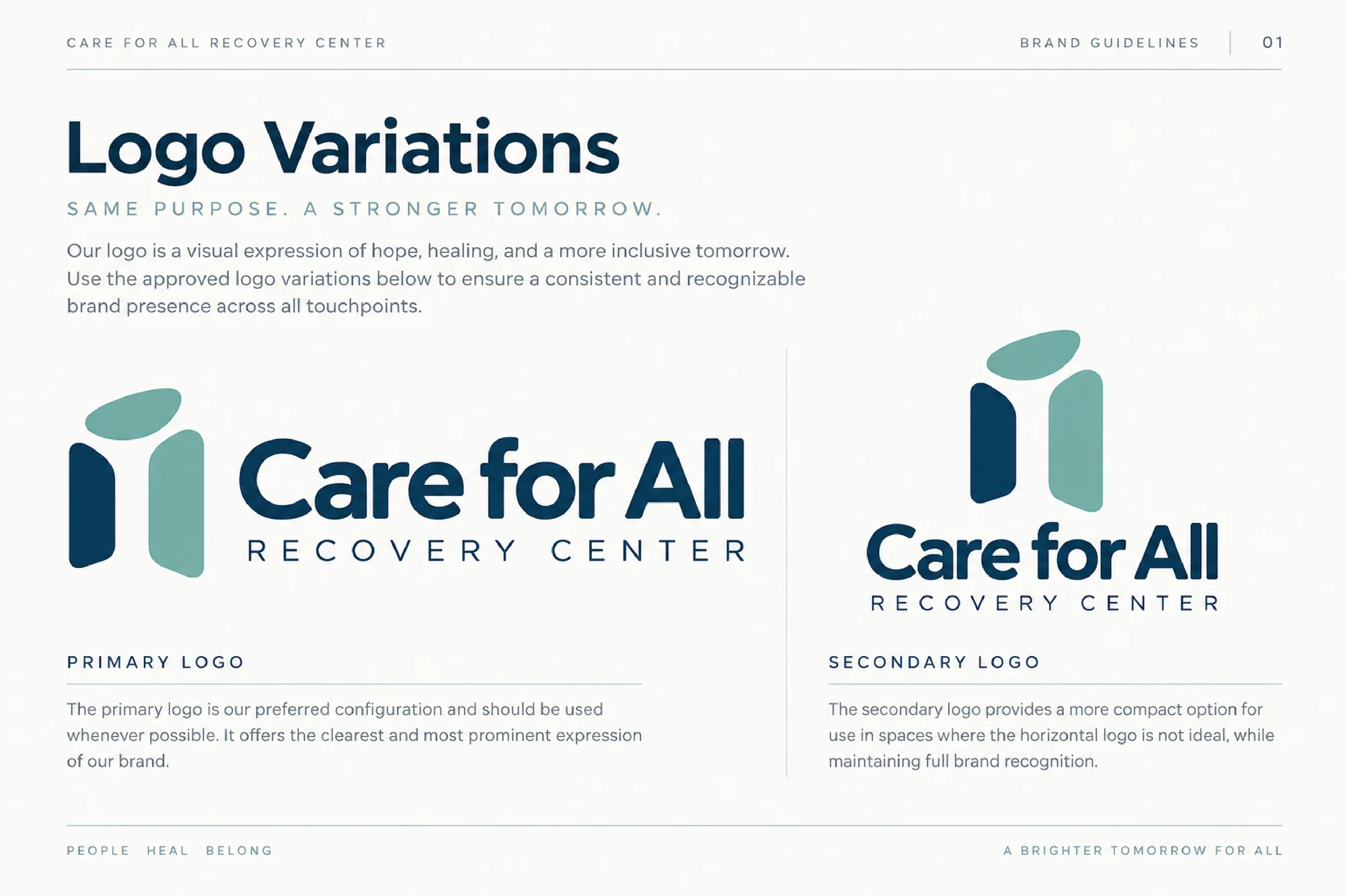
It comes in two versions — a horizontal primary logo, and a stacked secondary logo for tighter spaces.

Care for All Recovery Center logo: horizontal primary logo and stacked secondary logo

Colour & typography

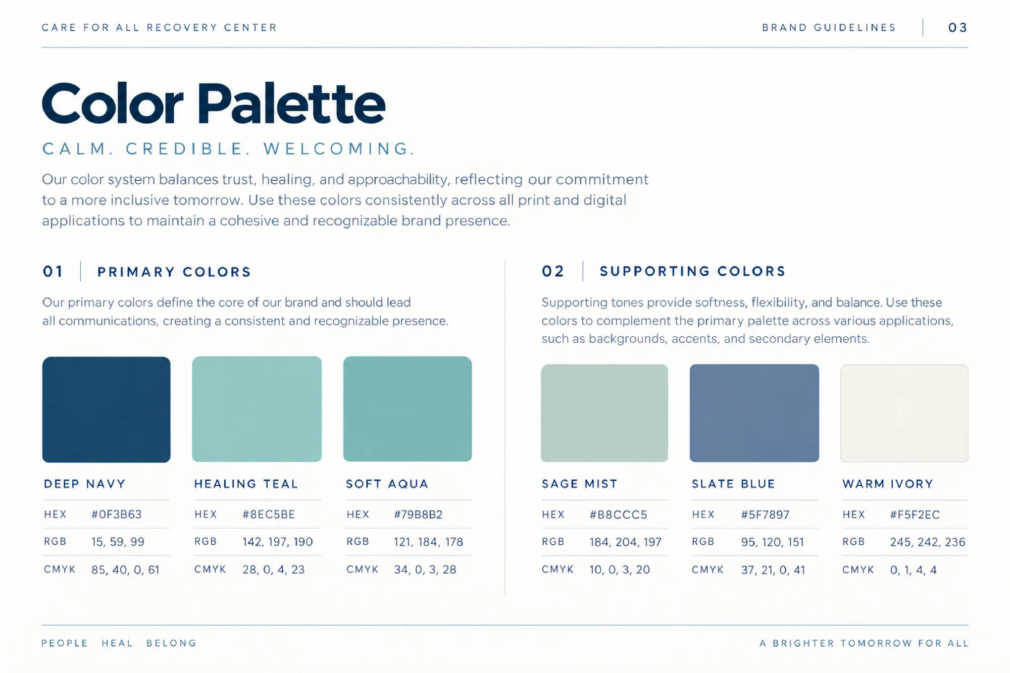
The palette balances trust, healing and approachability. Deep navy, healing teal and soft aqua lead, with sage mist, slate blue and warm ivory supporting them.

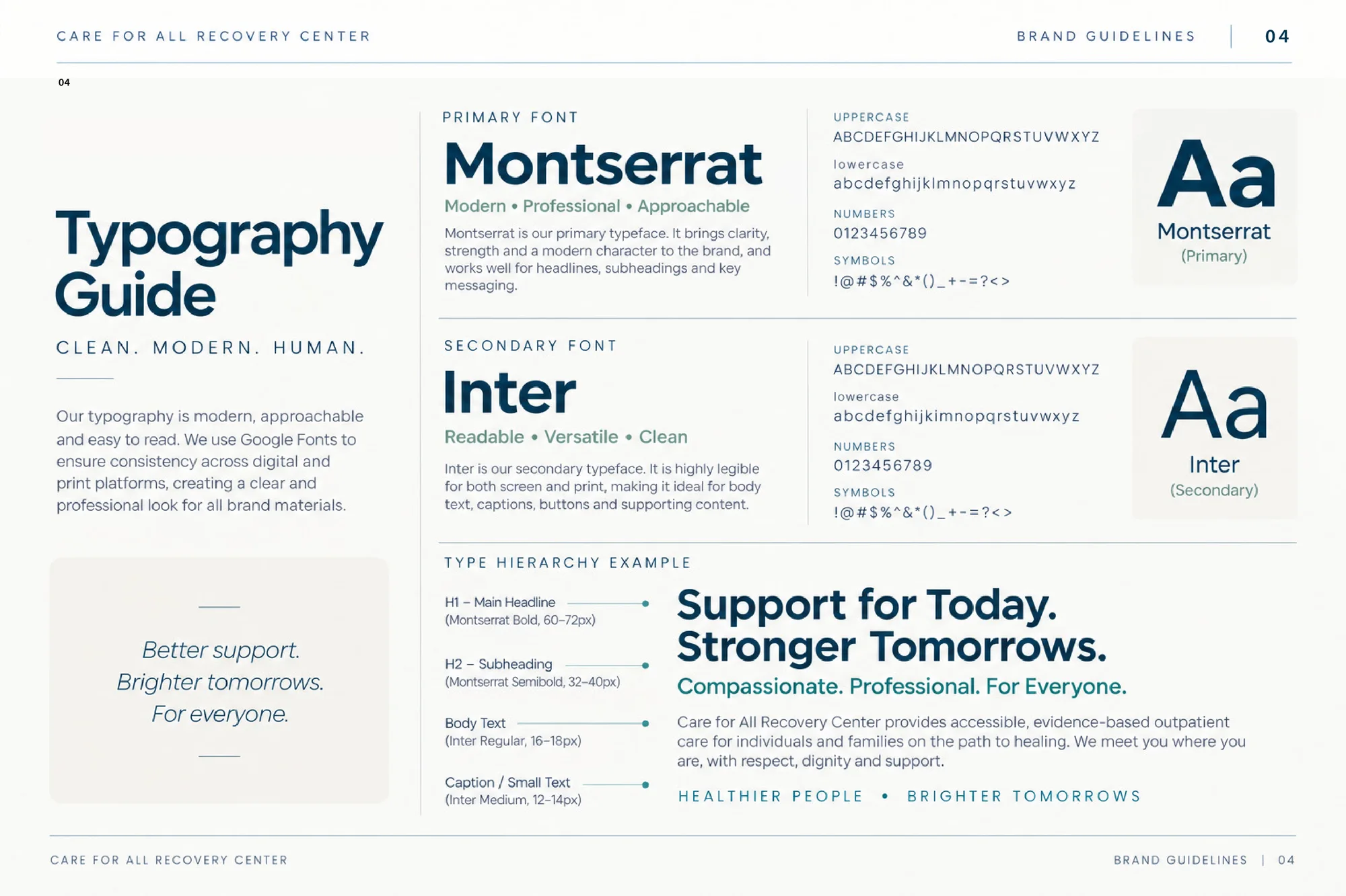
Montserrat carries headlines and key messages, and Inter keeps body text clear and easy to read.
Deep Navy

#0F3B63

Healing Teal

#8EC5BE

Soft Aqua

#79B8B2

Sage Mist

#B8CCC5

Slate Blue

#5F7897

Warm Ivory

#F5F2EC

Aa

Montserrat

Primary — headlines, subheadings and key messages

Aa

Inter

Secondary — body text, captions and buttons

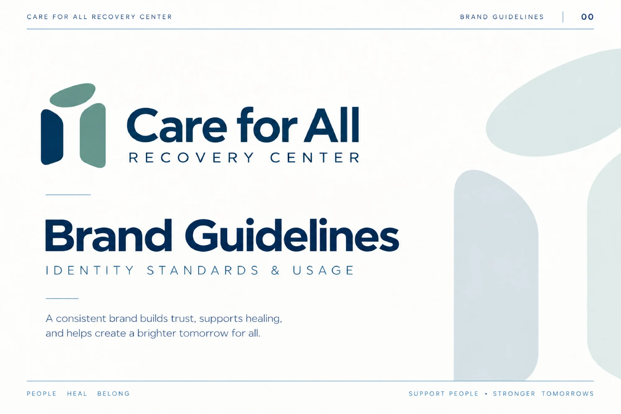
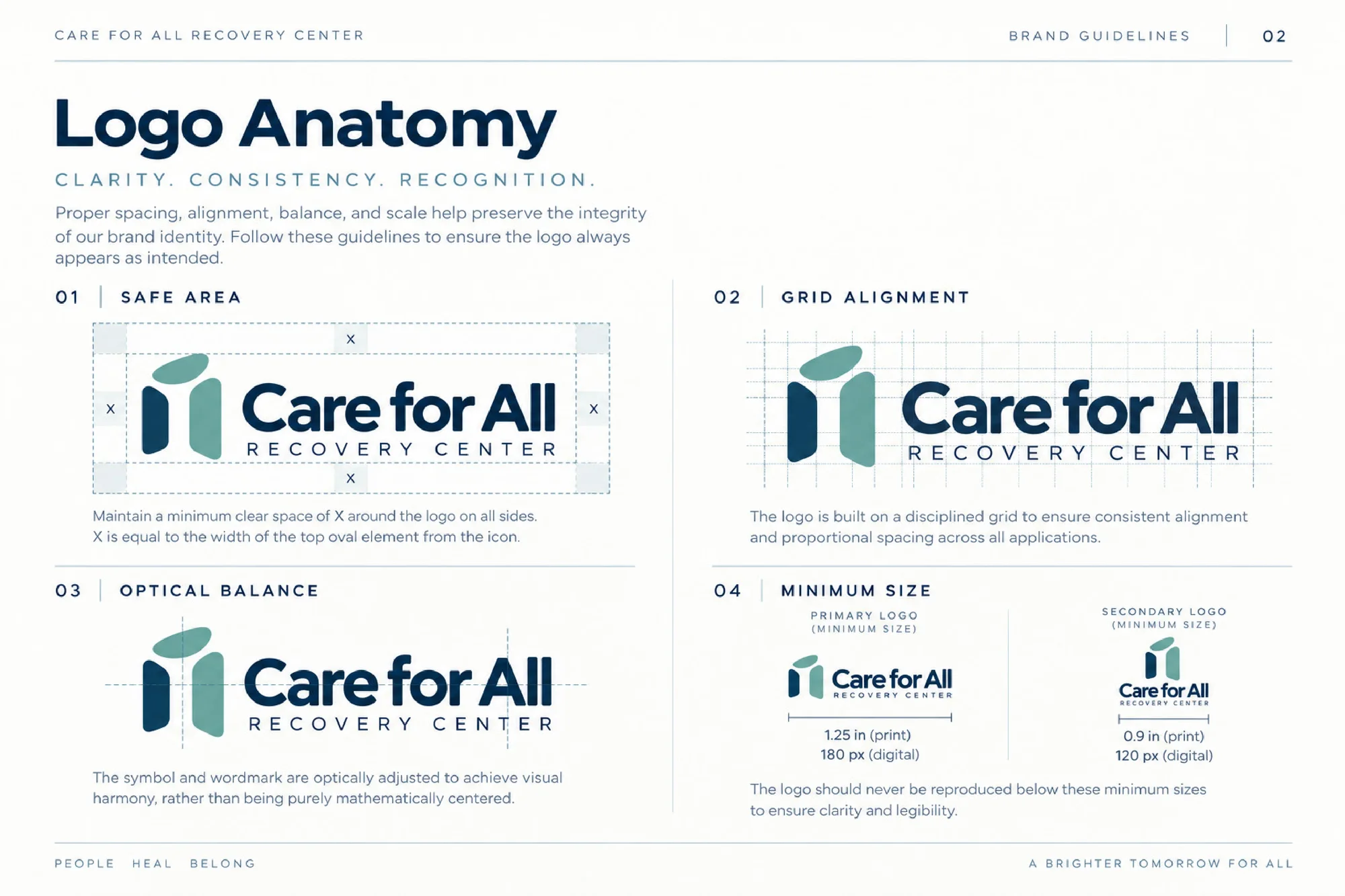
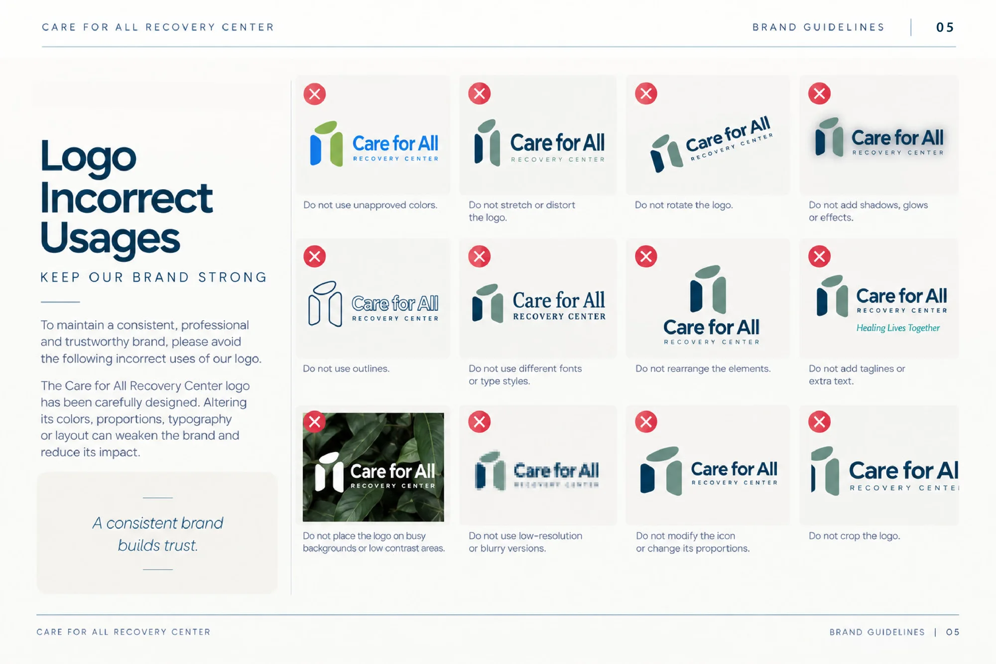
Brand guidelines

Six pages covering the logo variations, logo anatomy and safe area, the colour palette, typography and incorrect logo usage.

In use

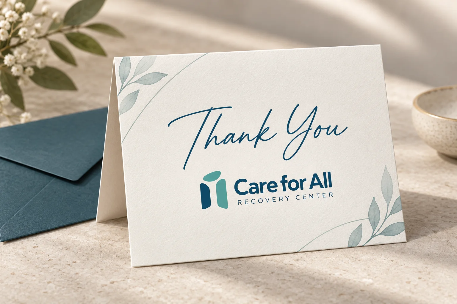
The identity on exterior building signage and a thank-you card.